6 Timeless Paint Colors for Home Interiors That Never Go Out of Style
When it comes to designing a space that feels elegant, welcoming, and lasting, few decisions are as crucial as the colors you choose for your walls. Paint sets the tone—literally—for your entire home. It defines how light bounces through a space, how furnishings feel against it, and how calm or energetic a room becomes. But while trendy colors often come and go like the seasons, certain paint shades have earned a reputation for their longevity and versatility. These timeless colors quietly hold their place, never demanding attention but always elevating the ambiance. Whether you’re planning a complete home renovation or just refreshing a single room, choosing one of these enduring hues is a smart move that adds both beauty and value to your space.

Timeless paint colors are not about being boring or basic—they’re about being adaptable, classic, and endlessly stylish. These shades blend beautifully with changing décor styles, from modern minimalism and rustic farmhouse to traditional and transitional design. They look just as good in a downtown apartment as they do in a cozy countryside cottage. And perhaps best of all, they serve as a neutral foundation, allowing you to change furniture, textiles, and accessories without having to constantly repaint. Ready to discover the colors that have proven their staying power time and time again? Let’s dive into six tried-and-true paint colors that have remained beloved choices for designers and homeowners alike.
1. Soft White: The Clean Slate That Never Fails

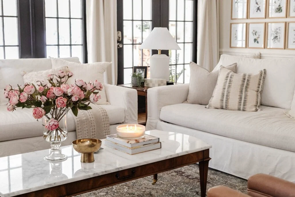
Soft white is the ultimate timeless paint color. Unlike pure, bright white—which can often feel too stark or sterile—soft white has a warm or creamy undertone that brings a subtle softness to a room. It’s the color of fresh linens, warm sunlight, and breezy open spaces. This shade works as a perfect canvas for any interior design style. Whether you’re decorating with vintage finds, sleek modern pieces, or cozy boho layers, soft white helps everything else in the room stand out without overwhelming the senses.
What makes soft white such a dependable choice is its ability to adapt. In rooms with lots of natural light, it reflects warmth and brightness, creating an airy feel. In darker spaces, it holds its own and helps prevent the room from feeling too closed in. Soft white works especially well in living rooms, bedrooms, kitchens, and hallways—essentially any area where you want a sense of calm and openness. It also complements every material, from rustic woods to polished metals and colorful artwork.
When selecting a soft white, be sure to pay attention to undertones. Some lean slightly gray, others beige, and some carry a barely-there blush or buttery tone. Sampling on your actual walls is essential. Designer favorites include Benjamin Moore’s “White Dove,” Sherwin-Williams’ “Alabaster,” and Farrow & Ball’s “Pointing”—each offering a different flavor of softness that never goes out of style.
2. Greige: The Warm-Cool Neutral Everyone Loves
Greige, the hybrid child of gray and beige, is one of those rare paint colors that feels both sophisticated and completely livable. It’s not too cool, not too warm—just perfectly in between. That’s exactly why it continues to be one of the most loved and recommended paint choices year after year. Greige works in nearly any room, in any style of home, and with almost any color palette. It’s especially ideal for those who want a neutral backdrop but find pure gray too cold and beige too bland.
In open-concept homes, greige is a superstar. It creates a cohesive flow between spaces while allowing each room to retain its own character. It pairs beautifully with natural elements like stone, wood, and woven textiles. In daylight, greige tends to lean warmer and cozier, while in artificial lighting it reveals cooler, taupe-gray undertones. That duality makes it an excellent choice for both north- and south-facing rooms.
For those looking to create a peaceful and inviting atmosphere, greige provides the perfect balance. It looks stunning with whites, navy, blush, and sage, allowing you to rotate seasonal decor without clashing. Some of the most popular greige tones include Benjamin Moore’s “Revere Pewter,” Sherwin-Williams’ “Agreeable Gray,” and Behr’s “Natural Gray.” Whether you’re painting an entryway, a guest bedroom, or an entire living space, greige is the chameleon color that effortlessly adapts—and endures.
3. Navy Blue: Bold Yet Endlessly Sophisticated
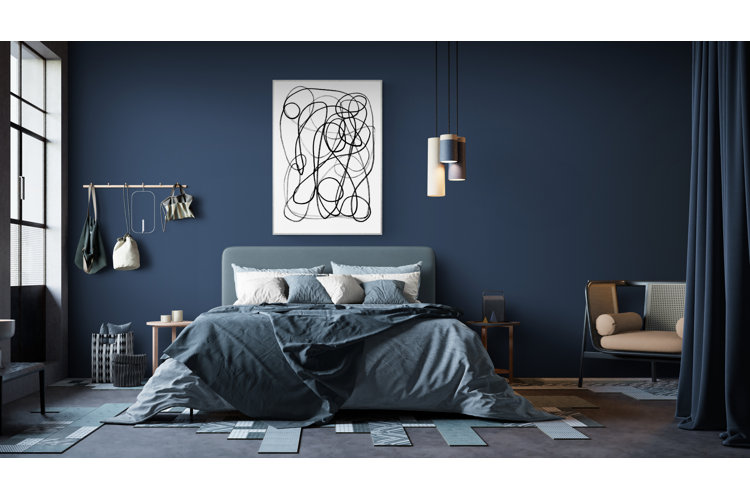
Navy blue might seem like a bold choice at first, but it’s actually one of the most timeless colors you can bring into your home. It’s rich, elegant, and deeply grounding—like your favorite pair of jeans or a perfectly tailored blazer. While navy adds a sense of drama to a room, it never feels trendy or overpowering when used thoughtfully. It creates a strong contrast when paired with crisp white trim, warm metallics like brass or gold, or lighter wood finishes.
Navy works exceptionally well in spaces where you want to add visual depth or coziness. Think dining rooms, powder rooms, home offices, or even kitchen cabinets. It can serve as a stunning accent wall in a bedroom or a bold all-over choice in a moody, intimate lounge. The beauty of navy is that it plays well with a wide range of other shades—from soft pinks and creamy whites to emerald green and mustard yellow. It also works across design styles, from nautical and coastal to modern and classic.
To keep navy from overwhelming your space, pair it with plenty of light—natural or artificial—and offset it with lighter elements like neutral rugs, sheer curtains, or white bedding. A few go-to navies designers love are Benjamin Moore’s “Hale Navy,” Sherwin-Williams’ “Naval,” and Farrow & Ball’s “Stiffkey Blue.” Used correctly, navy can feel both cozy and refined, always making a space feel finished and intentional.
4. Sage Green: Soft, Serene, and Naturally Beautiful
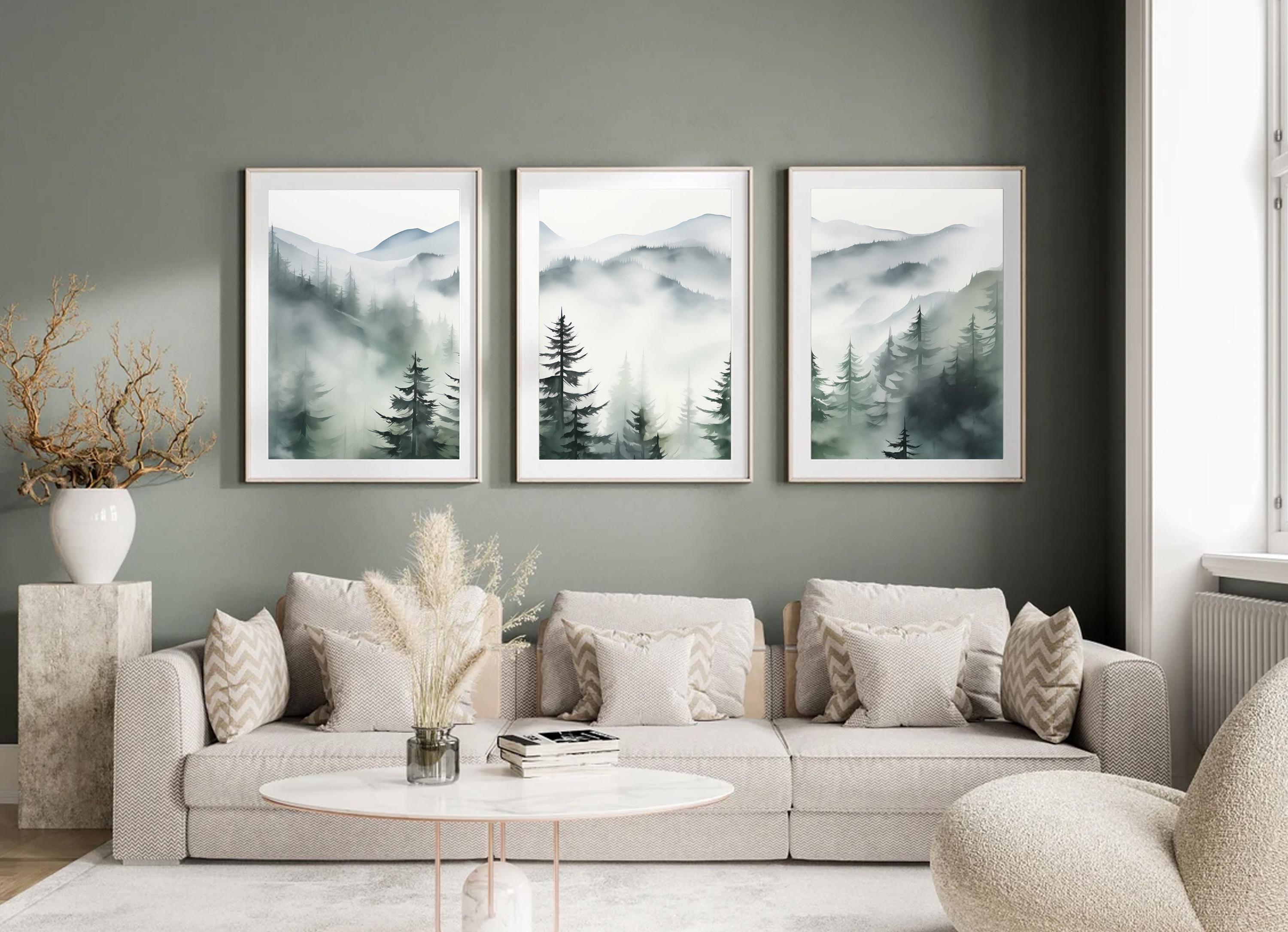
If there’s one color that has proven it can bridge both trend and timelessness, it’s sage green. Inspired by nature, this muted, grayish-green hue brings a soft and calming energy to interiors. It’s subtle enough to be used like a neutral, but it still offers a pop of organic color that feels both refreshing and grounded. Sage green has been used for centuries in traditional homes, but it’s also a staple in modern Scandinavian and farmhouse interiors.
Sage green thrives in rooms where relaxation and serenity are the goal. It’s a go-to choice for bedrooms, bathrooms, nurseries, and kitchens. It pairs beautifully with natural elements like oak, stone, rattan, and terracotta, creating an earthy, harmonious feel. If you’re decorating with whites, creams, or warm woods, sage green enhances those tones without competing for attention. It also works well with black accents, brass finishes, and even pops of blush or muted coral.
The beauty of sage is in its balance—it’s not too cold, not too bright, and never overwhelming. It’s the kind of color that instantly makes a room feel calm and lived-in, even if you just painted yesterday. Popular picks in this category include Farrow & Ball’s “Mizzle,” Behr’s “Sage Gray,” and Sherwin-Williams’ “Clary Sage.” For a color that whispers elegance rather than shouts, sage is a choice that will always feel in style.
5. Charcoal Gray: The Moodier Side of Neutrals

Charcoal gray is the go-to choice for anyone who wants to create a sense of sophistication and depth without defaulting to black. Rich and refined, charcoal adds drama to a space in a way that still feels accessible and timeless. It’s darker than greige but more flexible than black, making it ideal for feature walls, cabinetry, or entire rooms that crave a moody touch.
This shade works best in spaces where you want to create intimacy or coziness—think master bedrooms, dens, libraries, or formal dining rooms. Charcoal can read warm or cool depending on the undertones, so it’s important to sample carefully in your own space. It pairs gorgeously with lighter neutrals, natural textures, jewel tones, and metals like gold and chrome. It also makes art, greenery, and white trim really pop.
Used strategically, charcoal gray creates a timeless, high-end look that feels layered and considered. Some popular options include Benjamin Moore’s “Kendall Charcoal,” Sherwin-Williams’ “Peppercorn,” and Farrow & Ball’s “Down Pipe.” If you love depth but aren’t ready for full-on black, charcoal is the perfect in-between—bold but forever stylish.
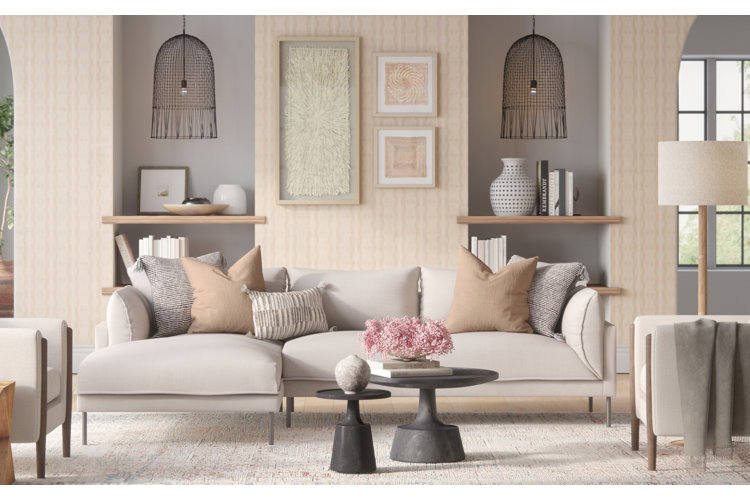
6. Warm Taupe: Earthy, Cozy, and Undeniably Classic

Warm taupe is the quiet hero of timeless paint colors. Sitting somewhere between beige, gray, and a soft brown, taupe has a natural warmth that instantly makes a space feel grounded and inviting. It’s a fantastic alternative to cooler grays or flat whites, offering depth without darkness and elegance without effort. Taupe is especially effective in creating cozy, intimate spaces.
This shade shines in bedrooms, living rooms, and traditional dining spaces. It looks lovely alongside wood furniture, cream textiles, antique metals, and layered earth tones. It’s also a great canvas for both vintage and modern decor. Taupe is one of those colors that doesn’t shout for attention, yet it never disappears into the background. It always adds a little something special—whether it’s subtle richness, a hint of sophistication, or a sense of calm.
When choosing a taupe, pay attention to undertones—some lean pink, some more golden or violet. Benjamin Moore’s “Balboa Mist” and Sherwin-Williams’ “Accessible Beige” are perennial favorites for good reason. They strike the perfect balance between cozy and classy, offering a finish that never goes out of fashion.
Table Of Contante
| Paint Color | Tone | Best For | Pairs Well With | Mood/Effect |
|---|---|---|---|---|
| Soft White | Warm or cool | Living rooms, kitchens, hallways | Wood tones, brass accents, greenery | Clean, airy, classic |
| Greige (Gray + Beige) | Neutral mid-tone | Bedrooms, entryways, open floor plans | Black metals, natural fibers, minimalist décor | Calm, modern, sophisticated |
| Classic Navy Blue | Deep cool tone | Accent walls, dining rooms, offices | Gold, crisp whites, wood furniture | Elegant, moody, dramatic |
| Sage Green | Muted earthy green | Bedrooms, kitchens, bathrooms | Wicker, ceramics, cream tones | Fresh, grounding, serene |
| Charcoal Gray | Deep neutral | Living rooms, kitchens, exteriors | White trim, modern lighting, bold art | Sleek, cozy, contemporary |
| Warm Taupe | Earthy neutral | Bedrooms, family rooms, transitional spaces | Leather, linen, soft metallics | Cozy, versatile, timeless |
FAQs: Timeless Paint Colors for Interiors
Q1: What makes a paint color timeless?
A timeless paint color is versatile, neutral, and easy to pair with various styles and furnishings. These shades don’t follow fleeting trends and instead offer enduring appeal across decades.
Q2: Can I use multiple timeless colors throughout my home?
Absolutely! Many timeless shades complement each other. Using soft white in one room, sage in another, and greige as a hallway connector can create a cohesive yet dynamic look.
Q3: Are bold colors like navy still considered timeless?
Yes, when used thoughtfully. Navy, charcoal, and even deep green are all considered timeless when balanced with lighter tones and neutral finishes.
Q4: Should I sample paint before committing?
Yes. Always test swatches in your space. Lighting, furniture, and flooring can dramatically affect how a color looks on your walls.
Q5: What sheen should I use for timeless paint colors?
Matte or eggshell finishes work best for most walls, offering a modern yet soft appearance. Semi-gloss is great for trim and kitchens, while satin adds a subtle sheen to bathrooms and high-traffic areas.
Conclusion: A Color Choice That Lasts a Lifetime
Choosing a timeless paint color isn’t just about playing it safe—it’s about investing in beauty, harmony, and style that grows with you. These six enduring shades—soft white, greige, navy, sage green, charcoal gray, and warm taupe—have stood the test of time because they adapt, elevate, and inspire. Whether you’re starting fresh or simply refining your current space, these colors offer a foundation you can build on for years to come.
Leave a Reply