6 Timeless Paint Colors for Home Interiors That Never Go Out of Style
Trends may come and go like the seasons, but certain paint colors have an undeniable staying power. They’re the quiet classics—the ones that never try too hard, never overpower, and yet somehow always manage to make a room feel pulled together, intentional, and welcoming. These hues don’t rely on flash or hype. Instead, they work behind the scenes, elevating your home’s mood and style in subtle yet impactful ways.
Unlike trendy tones that can start to feel dated within a year or two (remember millennial pink or the gray craze?), timeless paint colors offer a kind of visual stability. They create a backdrop that looks beautiful now and will continue to look beautiful five, ten, even twenty years from today. They’re not tied to a particular era, design movement, or fleeting social media aesthetic—which makes them especially valuable for homeowners or renters who want longevity, consistency, and flexibility in their interiors.
:strip_icc()/BEHR_LIVINGROOM_KM_004_CottonKnit-8a73e4b0ebc54f74b6098bdf3696c5fc.jpg)
Whether you’re refreshing a single room, prepping your home for sale, or doing a top-to-bottom renovation, choosing one of these enduring shades means you won’t feel the itch to repaint every time a new TikTok or Pinterest trend goes viral. These are the colors that designers, stylists, and savvy homeowners return to again and again—because they work. They pair effortlessly with a range of materials, adapt to changing seasons, and play well with both vintage charm and modern minimalism.
From calming neutrals to sophisticated deep tones, each of the following six shades has proven its ability to stay relevant and beautiful no matter the design climate. So, if you’re searching for a paint color that you’ll still love just as much a decade from now as you do today, you’re in the right place. Let’s explore six timeless paint colors that never go out of style—and why they might just be the best investment you can make for your home’s interior.
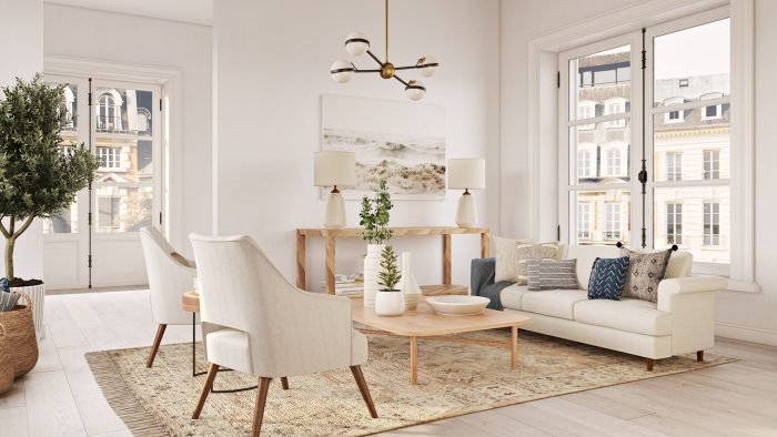
1. Soft White: Classic, Clean, and Always in Style
White is often seen as a “safe” choice, but don’t underestimate its power. A well-chosen soft white can make any space feel brighter, bigger, and more serene. Unlike stark, cold whites, a soft or warm white has just enough creaminess to give it depth without making the room feel yellow or dull.
Soft white works beautifully in every room—from kitchens and bathrooms to living rooms and bedrooms. It provides the perfect blank canvas for colorful artwork, textured textiles, and natural wood accents. It’s also a great choice if you love switching up your decor frequently—because white works with everything.
Designer tip: Look for whites with subtle undertones—like ivory, cream, or greige—to avoid that clinical feel. Some perennial favorites include Benjamin Moore’s “White Dove,” Sherwin-Williams’ “Alabaster,” and Farrow & Ball’s “Pointing.”
2. Greige: The Ultimate Modern Neutral
Greige—a blend of gray and beige—is one of those magical colors that somehow works in warm and cool spaces alike. It offers the warmth of beige with the sophistication of gray, making it incredibly versatile and calming.
Greige tones are perfect for open-concept homes where you want a unified look across multiple rooms. They adapt well to various lighting conditions and pair seamlessly with woods, metals, and pops of color. Unlike trendier grays that can feel cold or blue, greige brings a cozier, more grounded vibe.
Designer tip: Choose lighter greige tones for a modern farmhouse or transitional look, and richer greiges for a more dramatic or cozy feel. Try “Revere Pewter” by Benjamin Moore or “Agreeable Gray” by Sherwin-Williams.
3. Navy Blue: Deep, Sophisticated, and Surprisingly Versatile
:max_bytes(150000):strip_icc()/SPR-decorate-around-navy-blue-sofa-6386361-hero-c03a9ff760cf483cafa0c95061cfbb14.jpg)
Navy is the little black dress of paint colors—it’s classic, flattering, and works for just about any style. Though it’s a bold choice, it never feels trendy or dated. Navy walls add drama, depth, and elegance, yet still feel timeless when balanced with lighter furnishings or crisp white trim.
It’s an excellent choice for accent walls, powder rooms, dining rooms, or even kitchen cabinets. When paired with brass, marble, or warm wood tones, navy creates a sophisticated, upscale aesthetic that’s still comfortable and welcoming.
Designer tip: To keep navy from overwhelming a space, use it in rooms with lots of natural light or balance it with lighter furniture and accessories. Try “Hale Navy” by Benjamin Moore or “Naval” by Sherwin-Williams.
4. Sage Green: Nature-Inspired Calm That Endures

Earthy greens—especially soft sage tones—have made a strong comeback in recent years, but the truth is they never really left. Sage green is rooted in nature, so it naturally brings a sense of calm, balance, and freshness to a space. It’s soft enough to act like a neutral but still adds interest and a subtle pop of color.
Sage works well in bedrooms, kitchens, bathrooms, or anywhere you want to create a peaceful retreat. It pairs beautifully with natural materials like wood, stone, and rattan, making it a favorite in organic modern and Scandinavian interiors.
Designer tip: For a timeless look, avoid overly minty or neon greens. Stick with muted, gray-green tones like Farrow & Ball’s “Mizzle” or Behr’s “Sage Gray.”
5. Charcoal Gray: Elegant, Edgy, and Forever Sophisticated
If you’re drawn to moodier palettes but don’t want to commit to pure black, charcoal gray is a chic, timeless alternative. This deep, dramatic shade creates an intimate and stylish feel, especially in spaces like bedrooms, living rooms, or offices.
Charcoal is incredibly versatile—it can read cool or warm depending on the undertones you choose and the lighting in the room. It also plays well with soft whites, warm metallics, and even bold jewel tones.
Designer tip: Don’t be afraid to use charcoal on all four walls for a cocoon-like feel, especially in spaces where you want a bit more drama. Try “Kendall Charcoal” by Benjamin Moore or “Peppercorn” by Sherwin-Williams.
6. Warm Taupe: Understated and Cozy Without Feeling Dull
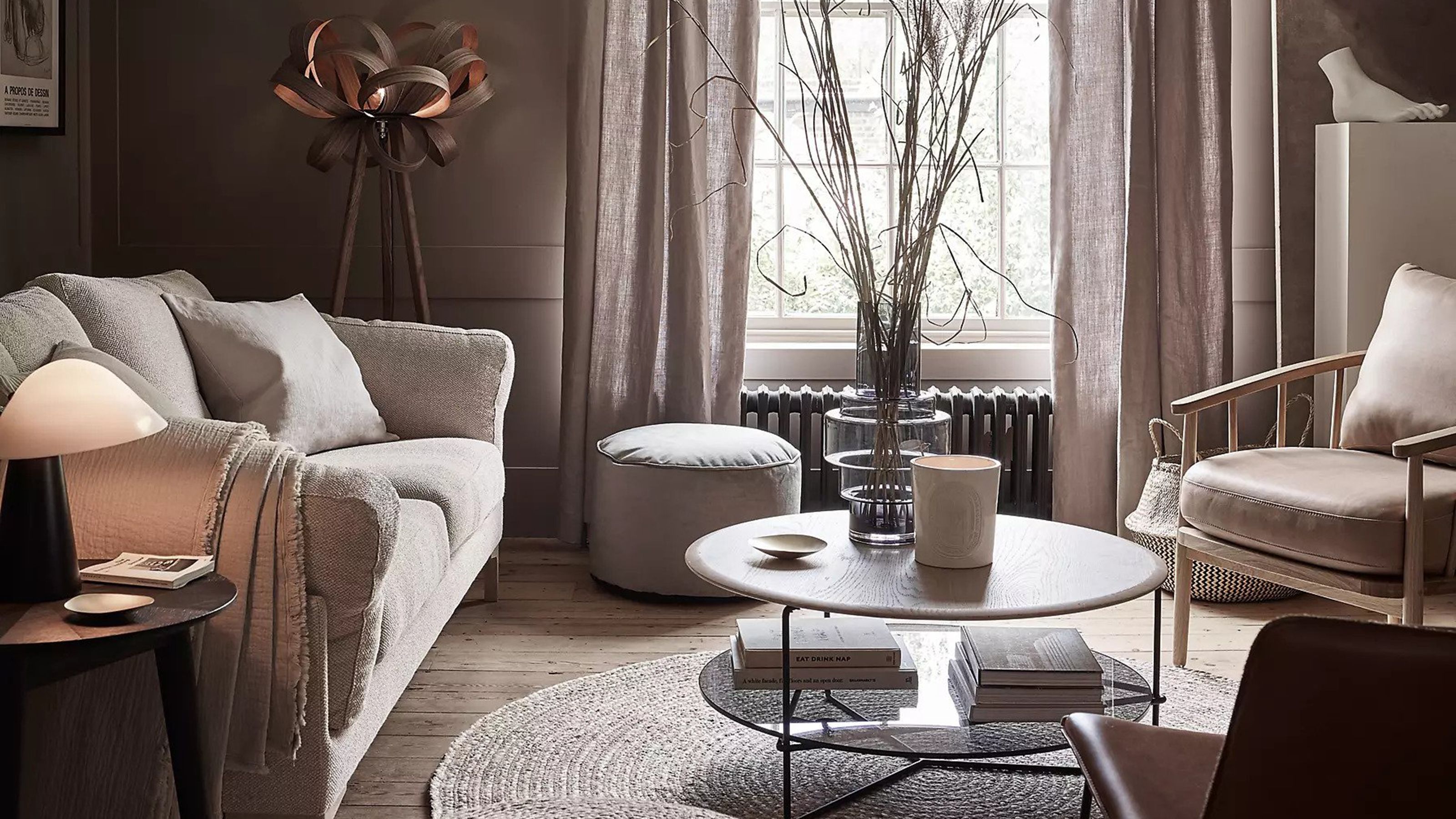
Taupe sits somewhere between gray and brown, offering a soft, inviting warmth that’s ideal for creating a cozy atmosphere. Unlike cooler grays, taupe brings an earthy undertone that makes a room feel grounded and timeless. It’s subtle, sophisticated, and works beautifully in both traditional and contemporary interiors.
Taupe is especially stunning in bedrooms, dining rooms, or any space where you want to promote calm and connection. It pairs effortlessly with natural textures, creamy whites, muted pastels, and even black for contrast.
Designer tip: Choose taupes with a touch of pink or lavender undertone for extra depth and elegance. Fan favorites include “Balboa Mist” by Benjamin Moore or “Accessible Beige” by Sherwin-Williams (yes, it’s a taupe!).
Table Of Content
| Paint Color | Why It’s Timeless | Best Rooms to Use It In | Designer Favorites |
|---|---|---|---|
| Soft White | Clean, calming, and endlessly adaptable. It reflects light beautifully and creates a fresh, open feeling in any space without feeling stark or clinical. | Living rooms, bedrooms, kitchens, hallways | White Dove – Benjamin Moore Alabaster – Sherwin-Williams Pointing – Farrow & Ball |
| Greige | A perfect mix of gray and beige. It’s warm, balanced, and fits seamlessly into any design—from traditional to contemporary. | Open-concept areas, bedrooms, dining rooms | Revere Pewter – Benjamin Moore Agreeable Gray – Sherwin-Williams |
| Navy Blue | Deep and dramatic without being trendy. Adds instant sophistication and works well with both bold and neutral decor. | Accent walls, powder rooms, kitchens, dining rooms | Hale Navy – Benjamin Moore Naval – Sherwin-Williams |
| Sage Green | Rooted in nature, this soft green promotes peace, balance, and subtle color without overwhelming the space. | Bedrooms, bathrooms, kitchens, home offices | Mizzle – Farrow & Ball Sage Gray – Behr |
| Charcoal Gray | Bold yet timeless. Adds elegance and depth to any space while staying grounded and refined. | Living rooms, offices, master bedrooms, entryways | Kendall Charcoal – Benjamin Moore Peppercorn – Sherwin-Williams |
| Warm Taupe | Cozy and earthy with a neutral tone that blends perfectly with a variety of materials and accent colors. | Bedrooms, dining rooms, reading nooks, traditional living areas | Balboa Mist – Benjamin Moore Accessible Beige – Sherwin-Williams |
FAQs: Choosing Timeless Interior Paint Colors
Q1: What makes a paint color “timeless”?
A timeless paint color is one that consistently looks good regardless of changing design trends. These colors tend to be neutral, natural, and versatile enough to work with a wide range of styles and furnishings.
Q2: Are neutral colors boring?
Not at all! Neutrals like greige, white, and taupe are the perfect backdrop for layering bold accessories, textures, and accent pieces. They give your design flexibility while maintaining elegance.
Q3: Can bold colors like navy really be timeless?
Yes! While bold, navy blue is considered a classic color—it has deep roots in traditional design and continues to look fresh in modern settings. When balanced well, it adds sophistication without overwhelming a room.
Q4: How do I test paint colors before committing?
Always sample your paint! Paint large swatches on your walls and observe them in natural and artificial light throughout the day. Colors can shift dramatically depending on lighting and surrounding finishes.
Q5: Should all the rooms in my house be painted the same color?
Not necessarily. While using a consistent palette can create flow, different rooms can have their own vibe. Stick to a family of complementary tones to maintain cohesion.
Conclusion: Build Your Forever Home—One Color at a Time
When it comes to interior design, choosing timeless paint colors is one of the smartest decisions you can make. These tried-and-true shades don’t just look good today—they’ll still look good five, ten, even twenty years from now. Whether you gravitate toward soft neutrals, moody hues, or nature-inspired tones, these six colors offer a solid foundation for a home that grows with you.
Instead of chasing fleeting trends, invest in colors that make your space feel grounded, elegant, and unmistakably you. With the right timeless palette, you’re not just painting walls—you’re creating an atmosphere that welcomes, soothes, and inspires for years to come.
Leave a Reply